The 2022 Color Forecast Is Centered Around Warm, Nostalgic Tones
Sherwin-Williams’ 2022 Colormix Forecast, dubbed MODE, marks a pivotal shift in interior design, moving away from the cool, muted neutrals that have dominated recent years and embracing a spectrum of warm, nostalgic hues. This year’s forecast is a celebration of comfort, creativity, and connection to both nature and memory, reflecting the collective desire for renewal and emotional well-being after a period of global upheaval.
The Essence of the 2022 Color Forecast: MODE
The MODE collection is composed of 40 carefully curated hues, organized into four distinct palettes: Method, Opus, Dreamland, and Ephemera. Each palette tells a unique story, drawing inspiration from art movements, historical periods, and the evolving ways we live and connect with our surroundings.
Method: Earthy, organic neutrals and sepia tones inspired by nature, art deco, and postmodernism.
Opus: Deep, dramatic hues and bold metallics, channeling maximalism and creative expression.
Dreamland: Soft, ethereal pastels and berry tones, rooted in Scandinavian minimalism and the concept of “hygge.”
Ephemera: Retro-inspired colors that evoke optimism and nostalgia, referencing the 1960s–1980s.
Let’s explore these palettes in depth, examine the psychology of warm colors, and discover how to bring this comforting, nostalgic trend into your own home.
Why Warm, Nostalgic Colors?
Sherwin Williams Opus pallet in foyer.
Courtesy of Sherwin-Williams
The shift toward warm, nostalgic tones is not arbitrary. After years of uncertainty and time spent indoors, homeowners are seeking spaces that feel safe, uplifting, and deeply personal. Warm colors—think rich reds, golden yellows, earthy browns, and organic greens—create a sense of intimacy and comfort, transforming rooms into sanctuaries that nurture the soul.
The Power of Nostalgia in Design
Nostalgia in interiors is more than a trend; it’s a psychological balm. Research shows that nostalgic environments can counteract feelings of loneliness, reduce stress, and enhance well-being by connecting us to cherished memories and simpler times. The rise of “nostalgiacore” and “nostalgia-core” decor reflects a widespread desire to blend the best of the past with the present, creating homes that tell personal stories and evoke happiness.
Palette Deep Dive: The Four Faces of MODE
Method: Nature’s Order and Organic Luxury
The Method palette is a tribute to the natural world, featuring shades that mirror the earth’s organic beauty—soft beiges, warm browns, muted greens, and sepia tones. Influenced by art deco and 1980s postmodernism, Method balances raw earthiness with refined luxury.
Key Colors:
Evergreen Fog SW 9130 (2022 Color of the Year): A calming, versatile green-gray that pairs beautifully with wood, stone, and natural fibers.
Accessible Beige SW 7036: A warm, inviting neutral ideal for open-plan spaces or as a backdrop for boho-inspired decor.
Über Umber SW 9107 and Shoji White SW 7042: Earthy, grounding tones that evoke stability and comfort.
Design Tips:
Pair Method colors with natural materials like rattan, linen, and unfinished wood for a harmonious, organic look.
Use these hues in living rooms, bedrooms, or entryways to create a welcoming, grounded atmosphere.
Courtesy of Sherwin-Williams
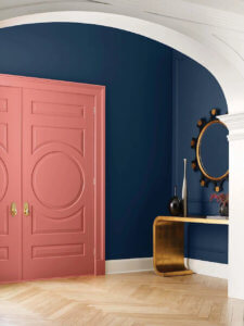
Opus: Maximalist Drama and Creative Expression
Opus is the boldest of the MODE palettes, embracing deep, moody colors and metallic accents that speak to a spirit of theatricality and modern maximalism. This palette is perfect for those looking to make a statement and infuse their spaces with energy and sophistication.
Key Colors:
Blackberry SW 7577: A rich, dramatic purple that adds depth and intrigue.
Iron Ore SW 7069: A dark, edgy charcoal that serves as a sophisticated alternative to black.
Bold metallics and jewel tones: Think gold, bronze, and deep blues for a touch of glamour.
Design Tips:
Use Opus colors in dining rooms, home offices, or powder rooms to create intimate, dramatic spaces.
Pair with metallic fixtures, velvet textiles, and statement lighting for a luxe, layered effect.
Dreamland: Softness, Serenity, and Scandinavian Minimalism
Dreamland is all about lightness and renewal, blending gentle pastels, berry tones, and organic greens to create an atmosphere of balance and hope. Inspired by modern Scandinavian design, this palette is ideal for cultivating a sense of “hygge”—the Danish concept of cozy contentment.
Key Colors:
Rosé SW 6290: A delicate pink that feels both romantic and modern.
Cucuzza Verde SW 9038: A fresh, organic green that brings the outdoors in.
Dynamo: An attention-grabbing berry that enlivens soft palettes with a pop of color.
Design Tips:
Use Dreamland in bedrooms, nurseries, or meditation spaces to foster tranquility and optimism.
Layer with soft textiles, curved furniture, and plenty of natural light for a dreamy, inviting vibe.
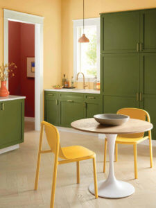
Ephemera: Retro Optimism and Playful Nostalgia
Ephemera is a joyful nod to the past, featuring colors that recall the optimism and playfulness of the 1960s–1980s. This palette is perfect for those who want to infuse their homes with personality and a sense of history.
Key Colors:
Sierra Redwood SW 7598: A warm, earthy red reminiscent of vintage decor.
Peace Yellow SW 2857: A cheerful, sunny yellow that brightens any space.
Basque Green SW 6426: A mossy, retro green that adds depth and character.
Design Tips:
Mix Ephemera colors with mid-century modern furniture, vintage accessories, and playful patterns for a true nostalgiacore look.
Use in kitchens, family rooms, or creative studios to spark joy and conversation.
The Science and Psychology of Warm Colors
Warm colors—reds, oranges, yellows, and browns—are known to advance visually, making spaces feel cozier and more intimate. They stimulate energy, creativity, and social interaction, making them ideal for gathering spaces like living rooms and dining areas.
Benefits of Warm Color Schemes:
Intimacy: Warm colors make large or stark rooms feel more inviting and secure.
Energy: These hues boost mood and creativity, perfect for artistic or collaborative spaces.
Positivity: Bright, sun-inspired colors evoke happiness and optimism, transforming everyday environments into cheerful retreats.
How to Incorporate Warm, Nostalgic Tones in Your Home
Start with Paint
Painting walls is the most impactful way to introduce warm, nostalgic tones. Consider an accent wall in a bold color like Sierra Redwood or Iron Ore, or go all-in with a full-room transformation using softer hues like Evergreen Fog or Accessible Beige.
Layer Textures and Patterns
Nostalgic interiors thrive on tactile variety. Mix velvet cushions, crochet throws, and aged wood for a lived-in, personal feel. Don’t shy away from retro patterns—florals, stripes, and geometric prints all add to the charm.
Curate Vintage and Modern Pieces
Blend old and new for a timeless look. Incorporate vintage furniture, heirloom accessories, and retro lighting alongside contemporary elements to create a space that feels both familiar and fresh.
Accessorize with Intention
Display family photos, trinkets from travels, and meaningful objects to personalize your space and evoke happy memories. Use antique clocks, retro signs, or even rotary phones as conversation starters and nostalgic focal points.
Embrace Maximalism or Minimalism—Your Way
Whether you prefer the layered look of maximalism or the calm of minimalism, warm, nostalgic colors work in both settings. The key is balance: let your personal story guide your choices, and don’t be afraid to mix patterns, textures, and eras.
The Broader Impact: Why Nostalgia and Warmth Matter Now
The resurgence of warm, nostalgic tones is part of a larger movement toward authenticity, sustainability, and emotional well-being in design. Earthy colors align with biophilic principles, bringing the outdoors in and fostering a sense of connection to nature. Meanwhile, the embrace of retro aesthetics reflects a desire for comfort and familiarity in an unpredictable world.
Real-World Inspiration: Sherwin-Williams Colors in Action
Designers and homeowners alike are embracing the 2022 palettes in creative ways:
Green Trance: Softens laundry rooms and pairs beautifully with brass and natural materials.
Grays Harbor: Adds depth and sophistication to mudrooms, especially when combined with wood accents.
Energetic Orange: Makes a bold statement in kitchens, energizing the space.
High Reflective White: Warms up bathrooms and balances darker hues for a fresh, inviting look.
Frequently Asked Questions
Q1: What is the main theme of the 2022 Sherwin-Williams Colormix Forecast?
A: The 2022 forecast, called MODE, centers on warm, nostalgic tones across four palettes—Method, Opus, Dreamland, and Ephemera—each inspired by nature, maximalism, Scandinavian minimalism, and retro optimism respectively.
Q2: Why are warm colors trending in interior design?
A: Warm colors create a sense of comfort, intimacy, and positivity. After years of cool neutrals, homeowners are seeking spaces that feel inviting and emotionally resonant, especially in times of uncertainty.
Q3: How can I use nostalgic colors without making my home look dated?
A: Blend retro-inspired hues with modern furnishings and accessories. Use vintage pieces sparingly, layer textures, and mix patterns thoughtfully to achieve a timeless, personal look.
Q4: Which rooms benefit most from warm, nostalgic palettes?
A: Living rooms, dining rooms, bedrooms, and entryways all benefit from warm tones. These colors foster connection, energy, and comfort, making them ideal for spaces where people gather or relax.
Q5: What is the 2022 Color of the Year, and how should I use it?
A: Evergreen Fog SW 9130 is the 2022 Color of the Year—a soothing green-gray that works beautifully with natural materials, soft whites, and earthy accents. Use it as a wall color, on cabinetry, or in textiles for a fresh, calming effect.

Jacob Bishop is the founder and CEO of Be Happy Property Services. With a strong background in property management and customer service, Jacob has dedicated himself to creating a company that prioritizes client satisfaction and seamless property experiences. His extensive knowledge and hands-on approach have earned him a reputation for excellence in the industry. Jacob’s passion for real estate and commitment to happy living spaces make him a trusted leader in property services.